Searching for the Origins of Redlining of Black Neighborhoods
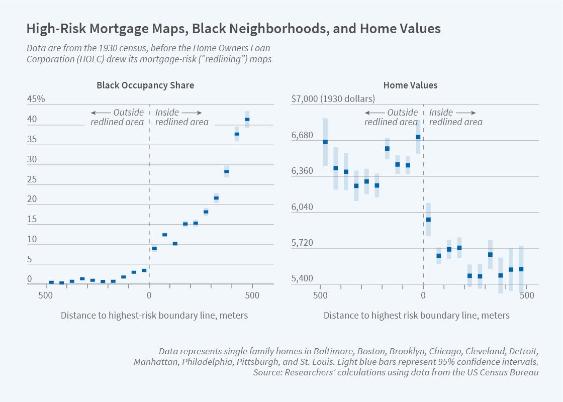
Black households were concentrated in distressed areas of Northern cities years before the federal government created color-coded maps to indicate investment risk.
Depression-era federal maps that classified areas of major US cities on the basis of credit risk did not create racially segregated neighborhoods, but rather locked in already existing patterns, according to research by Price V. Fishback, Jessica LaVoice, Allison Shertzer, and Randall Walsh that is presented in Race, Risk, and the Emergence of Federal Redlining (NBER Working Paper 28146).
The federal government became a major player in the housing market as part of the New Deal response to mortgage market distress in the 1930s. By 1936, the Home Owners’ Loan Corporation (HOLC) had purchased one-tenth of all non-farm US mortgages, relieving a burden on banks and offering favorable refinancing terms to homeowners.
To better manage its sprawling portfolio, the HOLC commissioned a survey of the riskiness of housing assets in neighborhoods of the more than 200 cities where it had refinanced loans. It graded neighborhoods on a scale from A through D, mapping them with the corresponding colors of green, blue, yellow, and red. The red areas on the maps identified locations where contemporary lenders said they were least likely to make loans. Although many believe the term “redlining” originated with these maps, the HOLC did not release the maps or neighborhood information to private lenders.
The researchers stress that the maps were created after the HOLC finished its refinancing efforts. Black households accounted for about 4.5 percent of the HOLC’s loans at a time when they accounted for only about 2.5 percent of mortgages from private lenders, suggesting that the HOLC exhibited less racial bias than other lenders of the day.
Around the same time the Federal Housing Administration (FHA) began insuring mortgage loans, primarily for new construction. The FHA developed its own mapping program and risk assessment grades, while continuing to insure mortgages to the present day. It is unclear how much the FHA relied upon the HOLC maps when determining their own neighborhood risk assessments because, to date, a complete set of FHA redlining maps have not been located by researchers.
The researchers analyze the HOLC maps and data gleaned from the 1930 and 1940 censuses. They construct a dataset covering individual households and neighborhoods for nine of the 10 largest US cities at that time. All are located in the North. They were home to nearly 18 million people, and to 38 percent of urban Blacks living outside the former Confederacy.
The study shows that Whites accounted for about 85 percent of households in the redlined neighborhoods, which encompassed about half of the households in the cities. The redlined predominately White neighborhoods had better census economic characteristics on average than redlined neighborhoods with above average shares of Black residents, the opposite of what would be expected if Black neighborhoods had been targeted for the lowest security grade because of race.
Data from the 1930 census show that Black households were already concentrated in distressed areas years before the HOLC assessment. “More than 80 percent and quite possibly more than 95 percent [of Black households] were redlined in the process of HOLC map-making because they had few choices outside Northern cities’ most economically disadvantaged neighborhoods,” the researchers write. “As a result, the HOLC maps are best viewed as providing clear evidence of how decades of unequal treatment effectively limited where Black households could live in the 1930s rather than reflecting racial bias in the construction of the maps themselves.”
— Steve Maas


